The Man Behind the Cans
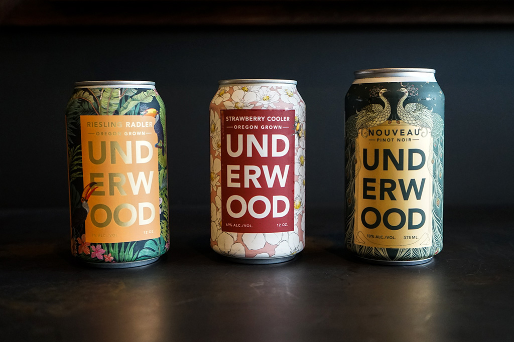
Jeremy Alan of The Ellaphant in the Room is the mural artist and illustrator behind three of our wine can designs—Riesling Radler, Strawberry Cooler and our most recent undertaking, Nouveau Pinot Noir. The first time we reached out to Alan was for a postcard project. After that experience we thought he might be a perfect designer to create a new can design for us.
That first design was for our Riesling Radler can. As different and beautiful as the wine it holds, this can is a huge hit with everyone who sees it. Since then we’ve continued to work with The Ellaphant in the Room on two more can designs and another postcard.
We asked Jeremy if he would answer a few questions for us about his work and the process of designing wine cans.
- How did Union Wine Co. start working with you?
Union Wine reached out to me in 2016 with a project to illustrate a promotional postcard. The idea was to draw the family of Underwood wine cans…crushed. I loved the idea and the visual possibilities of representing the crushed and folded can.

- Would you please tell us a little bit about you and your work?
My company is called The Ellaphant in the Room and is based in Brooklyn. I make hand-painted wall murals and print illustrations. I specialize in designing and painting murals by working with concepts and colors that complement existing interiors. My illustrations are small-scale artworks that are commissioned for both commercial magazines and privately sold for home décor.
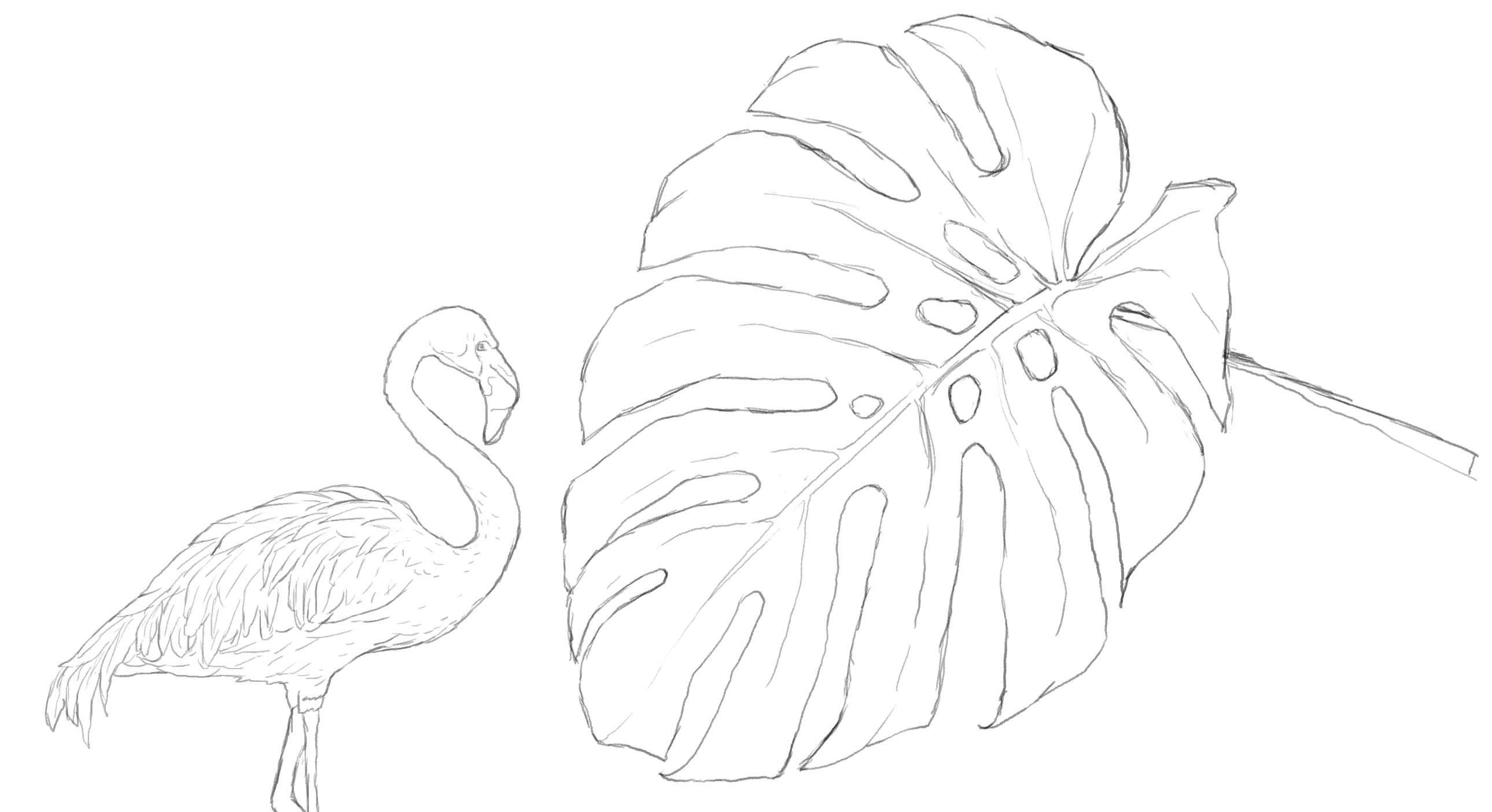
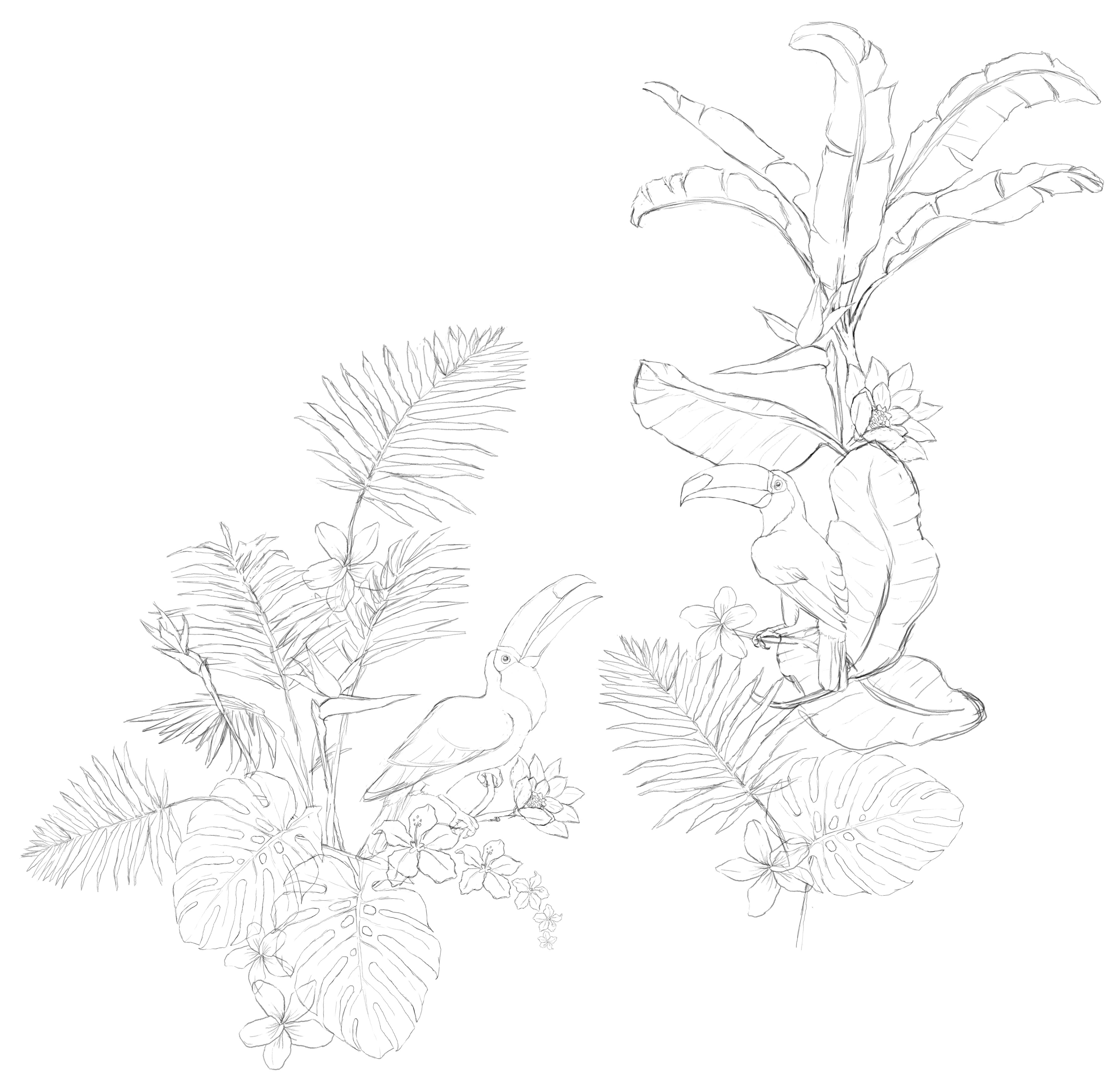
Riesling Radler (Released Summer 2017)
- How did this project start?
Ryan Harms and the designer working on this project reached out by email. This was my first time doing product design and I loved the idea of making an illustration that would wrap around a can. Ryan instantly established an open and collaborative approach to working together. He was open to ideas and made it easy to say yes to partnering for this seasonal wine project.
- How did this design come to be?
We started off with several different ideas. Again, the openness to creative possibilities gave me liberty to pursue a number of possibilities beyond the typical industry wine can design. The illustration was meant to reflect the wine flavor which has notes of citrus, hops, and summertime. We settled on tropical floral patterns as the direction. From there I began drawing tropical flora and fauna. I focused on individual leaves and began to work them into a pattern. Additional elements included tropical birds like toucans and flamingos. One thing I knew right away was that I wanted to have the green leaves be on a dark background.

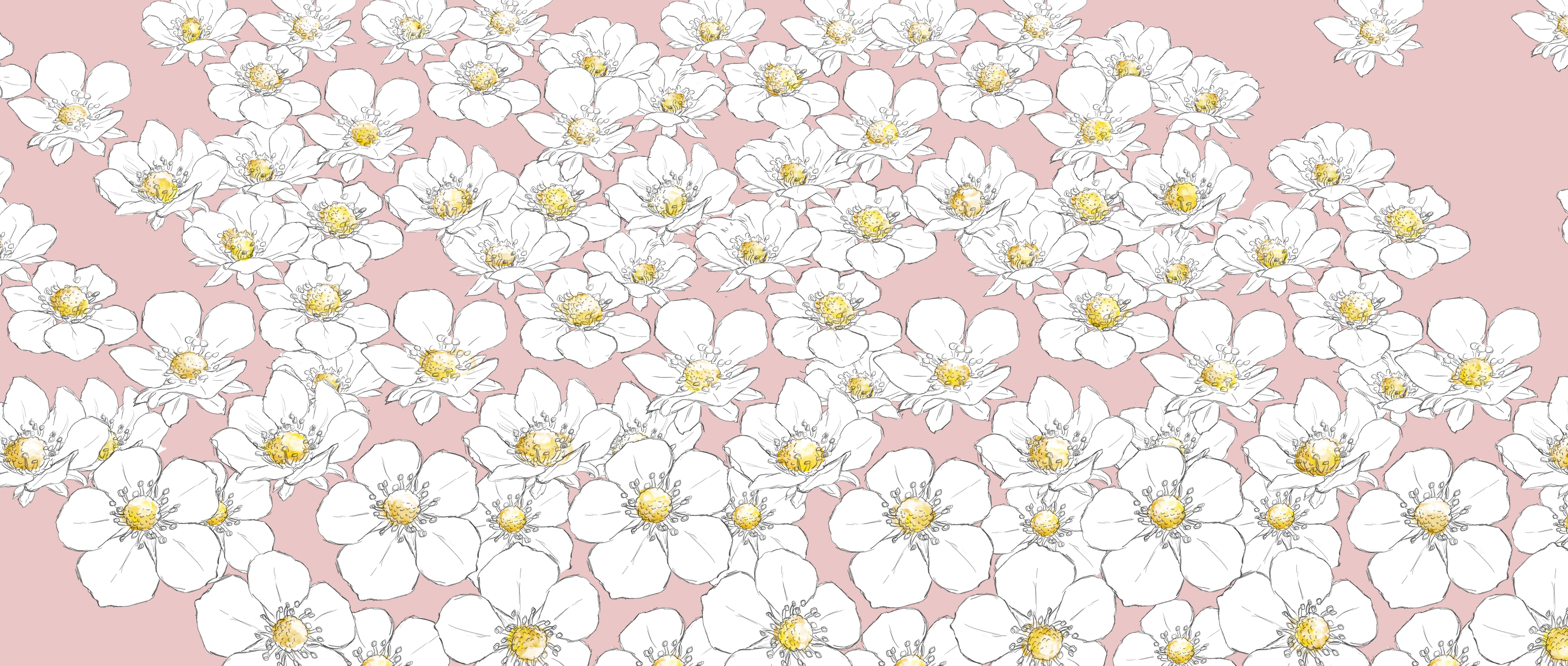
Strawberry Cooler (Released Summer of 2019)
- Please tell us about the design process for the Strawberry Cooler.
When Union Wine reached out to me about doing another can design the answer was obviously, yes! We immediately hopped on the phone and started talking.We talked about how the illustration should represent the specific wine flavor and reflect the experience of drinking the wine. With this can we came up with a number of different design directions including a surfboard pattern, a sun setting into the ocean and strawberry dreams with floating strawberries on clouds. These options were sketched out and mocked-up on the cans.
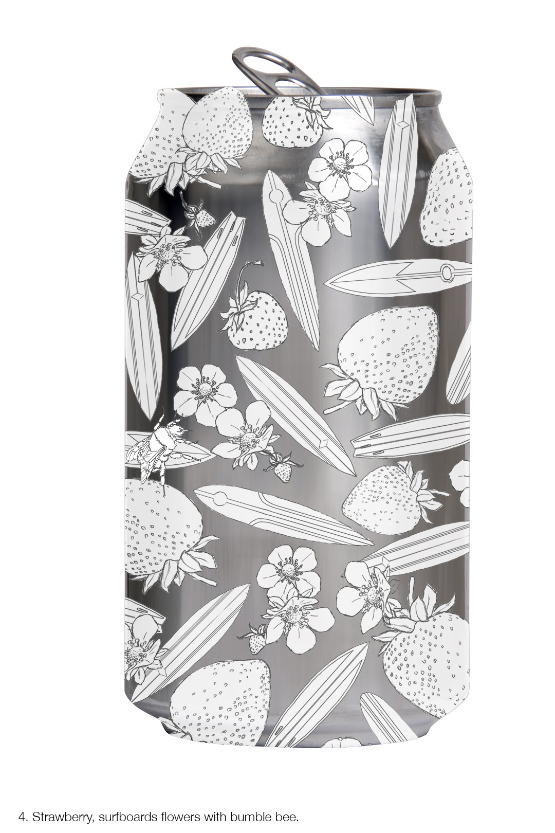

After numerous directions and ideas were explored, it was time to choose one. Since the wine cooler is strawberry flavored, the chosen theme was a field of strawberry flowers. The flowers were intended to look loosely sketched, as though they were made by someone relaxing in a park—drawing and taking in the summer day.
The most technical part was positioning the flowers on a diagonal so that when it wrapped around the can, it would connect and appear seamless.
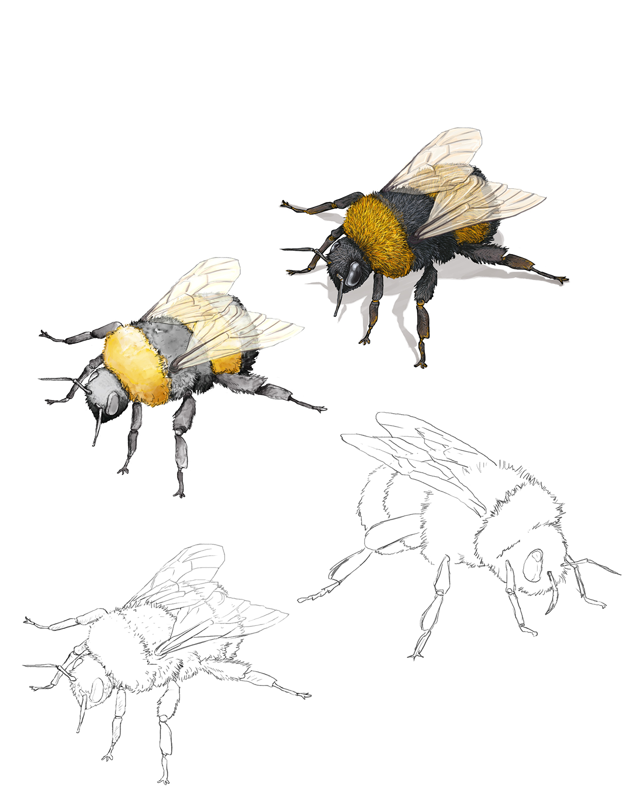
Another central compositional element is the bumblebee. The bee was intended to look like it was on the label, as though it had landed on the can, attracted to the strawberry flowers. The bumblebee was a perfect addition and echoed the focal point of the toucan on the Radler can.
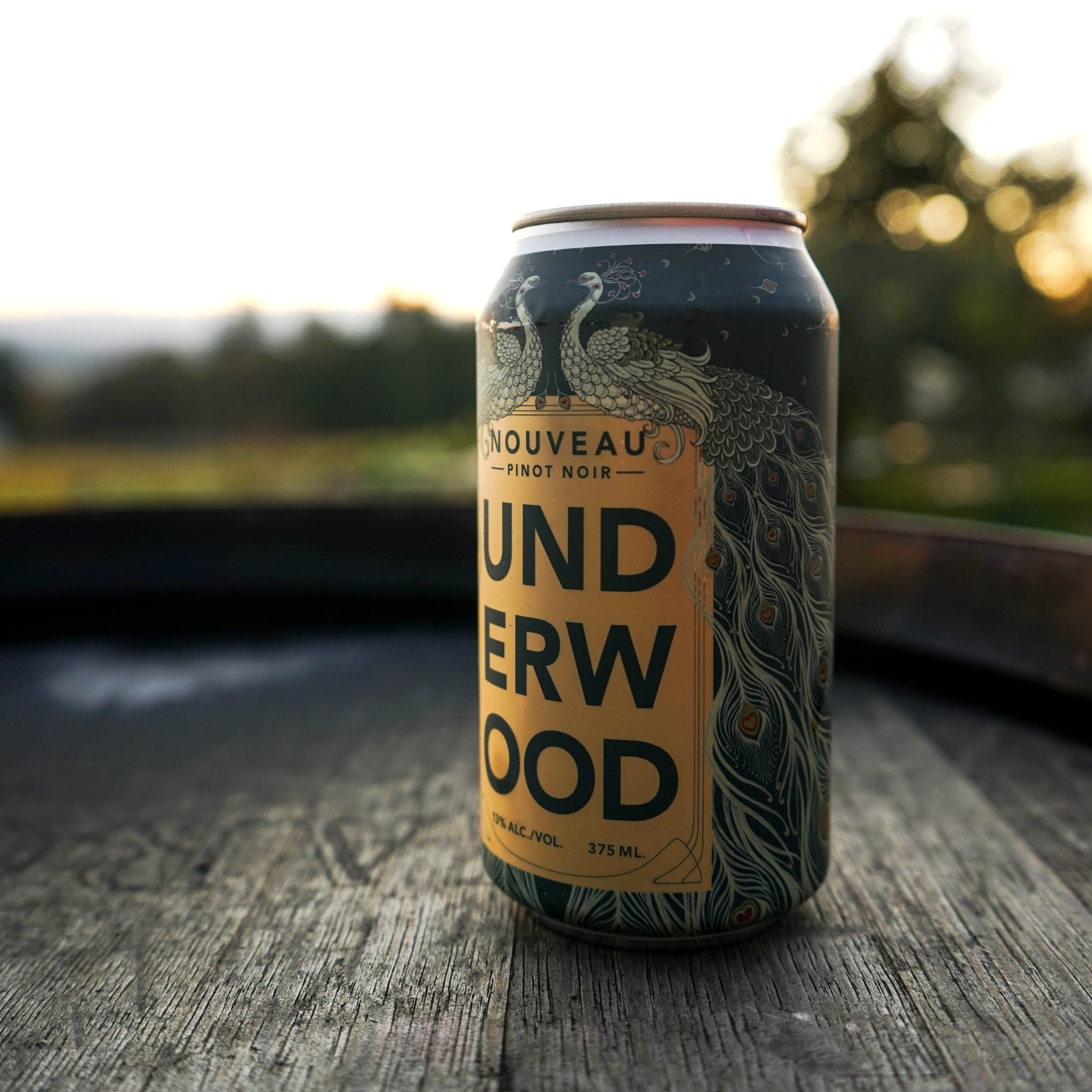
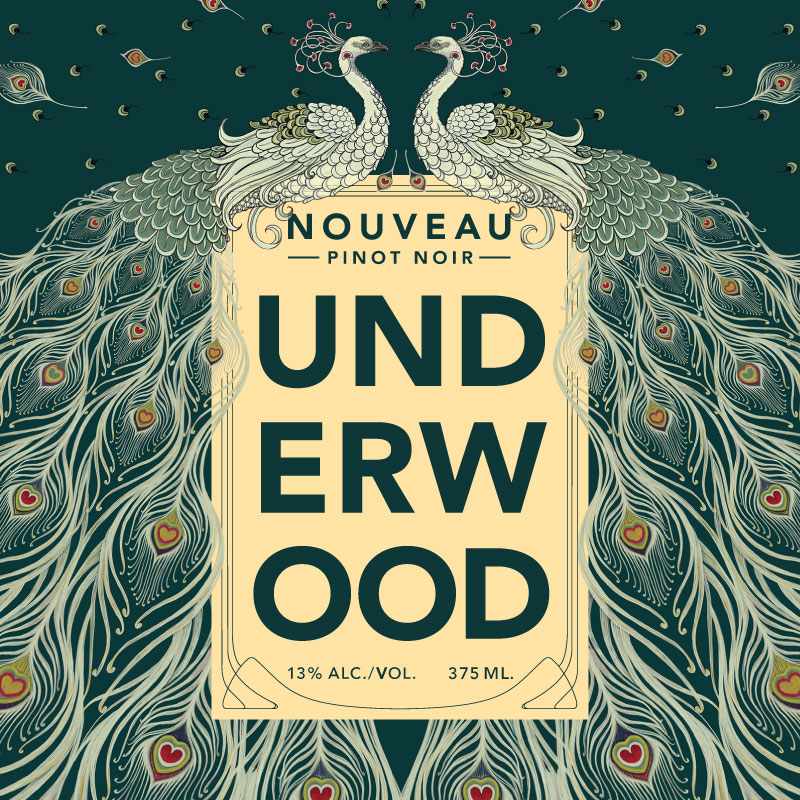
Nouveau (Released November of 2019)
- The Nouveau can is a design you just completed recently. Was there anything different about creating the design for this one?
Ryan and Joan called to discuss this project in February—9 months prior to a firm product release date of Nov. 21. This would be a limited release for Nouveau Day, the traditional day that Nouveau wines are released and tasted. That meant I only had about 5 weeks to complete the design.The brief for this project asked that I keep in mind the Underwood logo block on the front of the can as I thought about a few possible esthetic options: Art Nouveau, Bold Colors, Organic Elements, Architectural Elements, and the brief said I could be a little bit more “out there” for this style of wine compared to more typical Nouveau wine labels. After my conversation with Ryan and Joan, the first thing I did was to research Art Nouveau. It had been a while since studying the movement and I wanted to re-establish an understanding of the motivations and visual languages of the time.
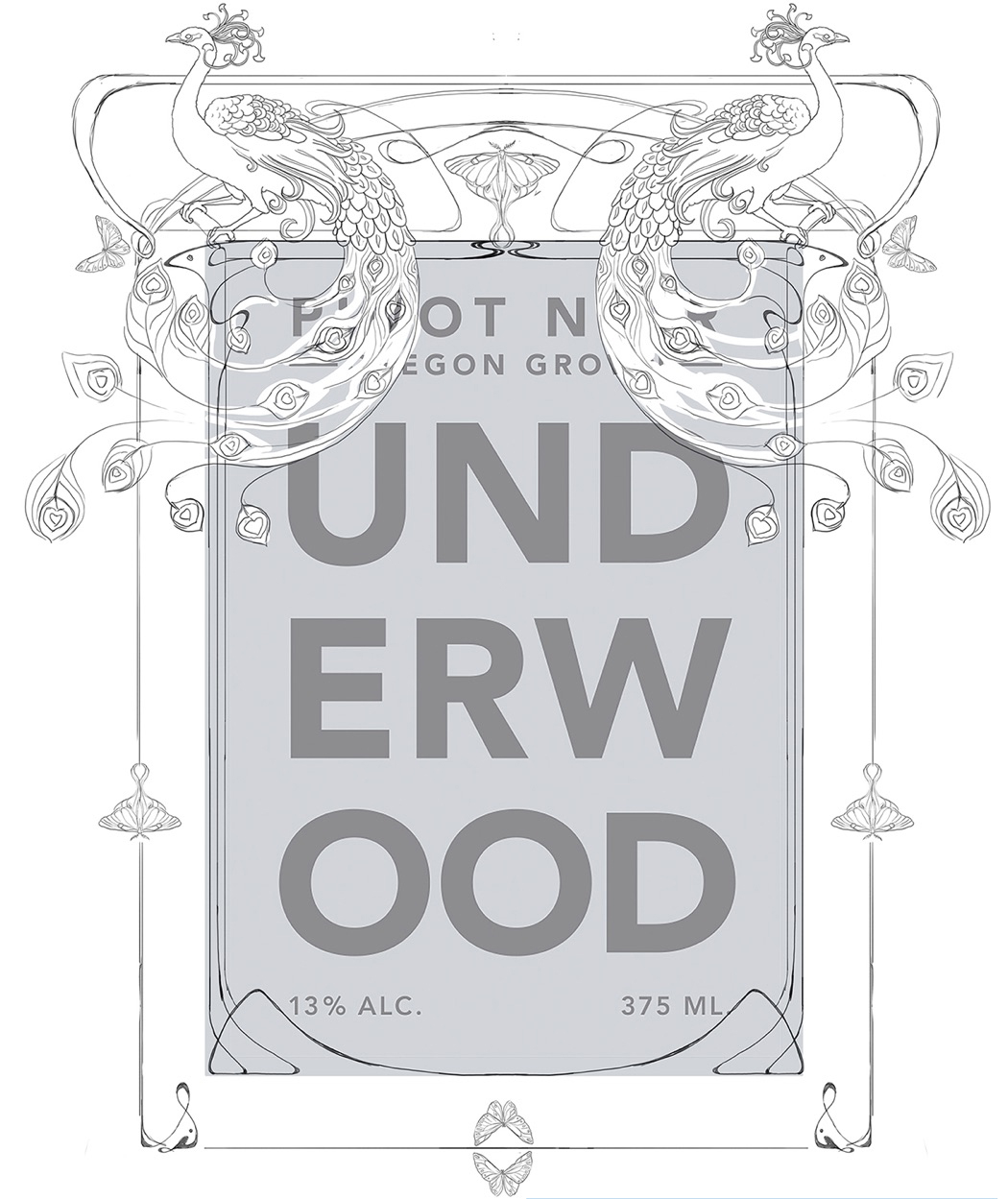
- What were some of the other directions you were thinking about before we landed on the peacock design?
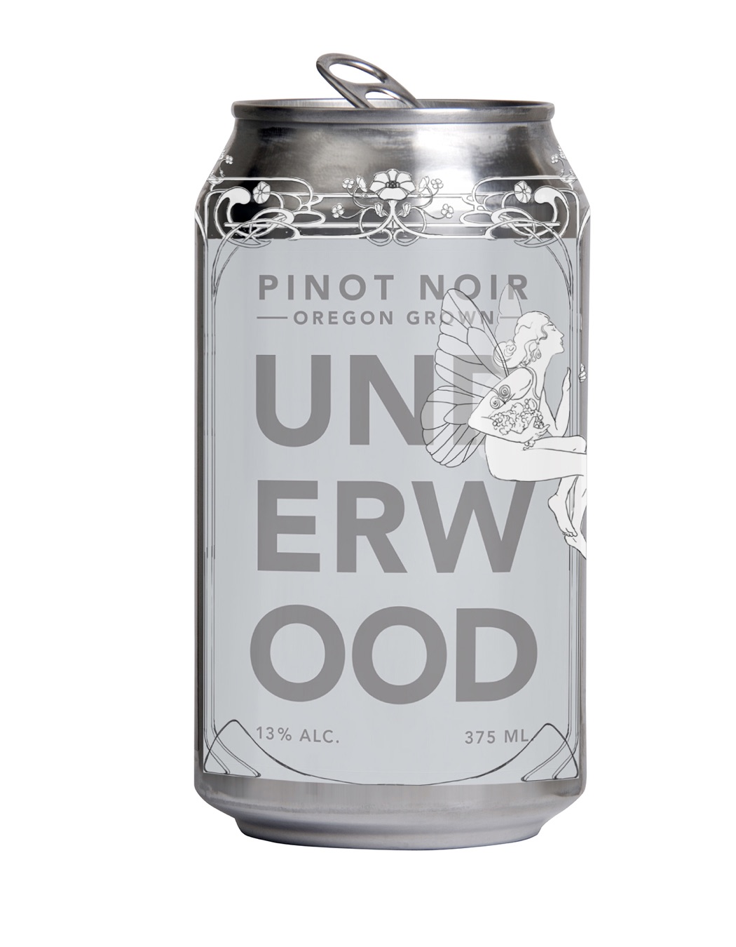
Some very cool directions emerged. I explored Architectural linework from the period as framing the label. One version had a fairy holding the ingredients of the wine and sitting atop the label. Peacocks were instantly intriguing along with dragonfly patterns and moths. In the end we chose the peacock with the tail feathers draping all the way around the can. The feathers evoke the sinuous lines of Art Nouveau architecture and the white peacock has graphic contrasts against the dark green can. A further thought on the white peacock is it almost subverts the expectations of the image since peacocks are usually vibrant, full-spectrum color…in a sense it made him more unique. The whimsy and freedom of illustration allows you to interpret the real world instead of relying on it. Hopefully, within that interpretation, I can direct the viewer towards the unique experience of the wine.
- Does anything stand out from when you designed any of the cans—something unique you remember?
The opportunity to dive into art history as the inspiration point for the Nouveau can was particularly exciting for me. Beginning with such an iconic style from history and to make it our own take was the challenge.
- You’ve designed three cans now, and although they are quite different from one another, they look great side-by-side. What is similar and what is different about the three designs, and why do they work so well together?
Each of the Union wine cans have different concepts driving the image, style and color decisions. One difference is how finished and complete the images are for the Radler and Nouveau, the Radler and Nouveau are both fully colored-in set against a dark background. The Strawberry can is intended to look like a sketch, open and loose with pencil lines and soft hits of water-colored pigments. As for similarities, their differences complement each other, they hopefully balance each other out. Additionally, each is based on patterns and images from nature and are all from my hand, unified by my mark and line.